Finding The Extra In The Ordinary: Part One
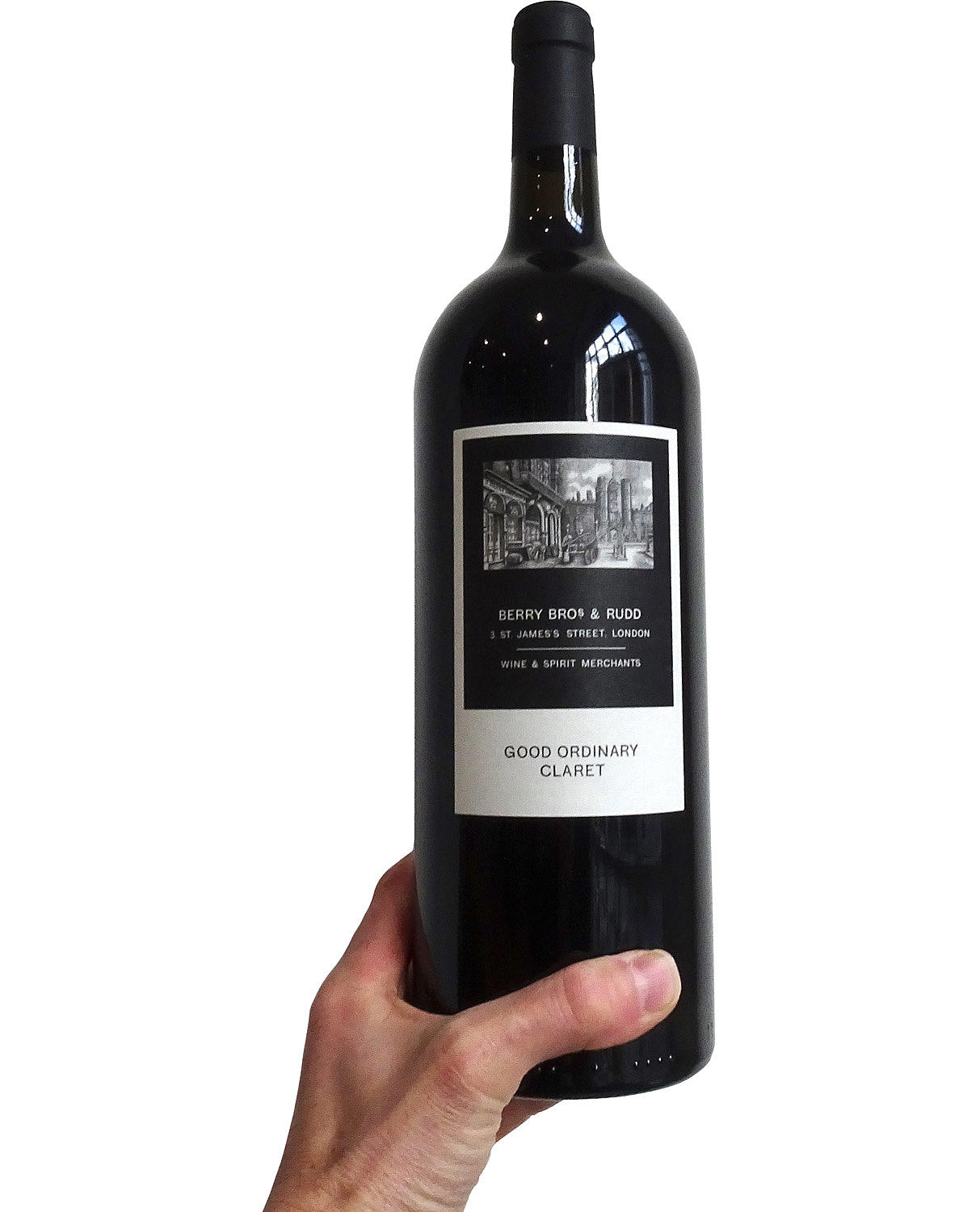
I have in my hand a magnum of Berry Brothers’ Good Ordinary Claret – one of our office Christmas presents. So, what has this to do with architecture or urbanism ?
Apparently, if I open the bottle, it has ‘a siren-like nose of black cherries, bramble fruit and wood smoke’. Well, I don’t know about that, but what I do know is that, apart from being delicious – especially with a hunk of Wensleydale and a sour-dough cracker - it reminds me of certain positive things we find in cities.
CONTINUITY
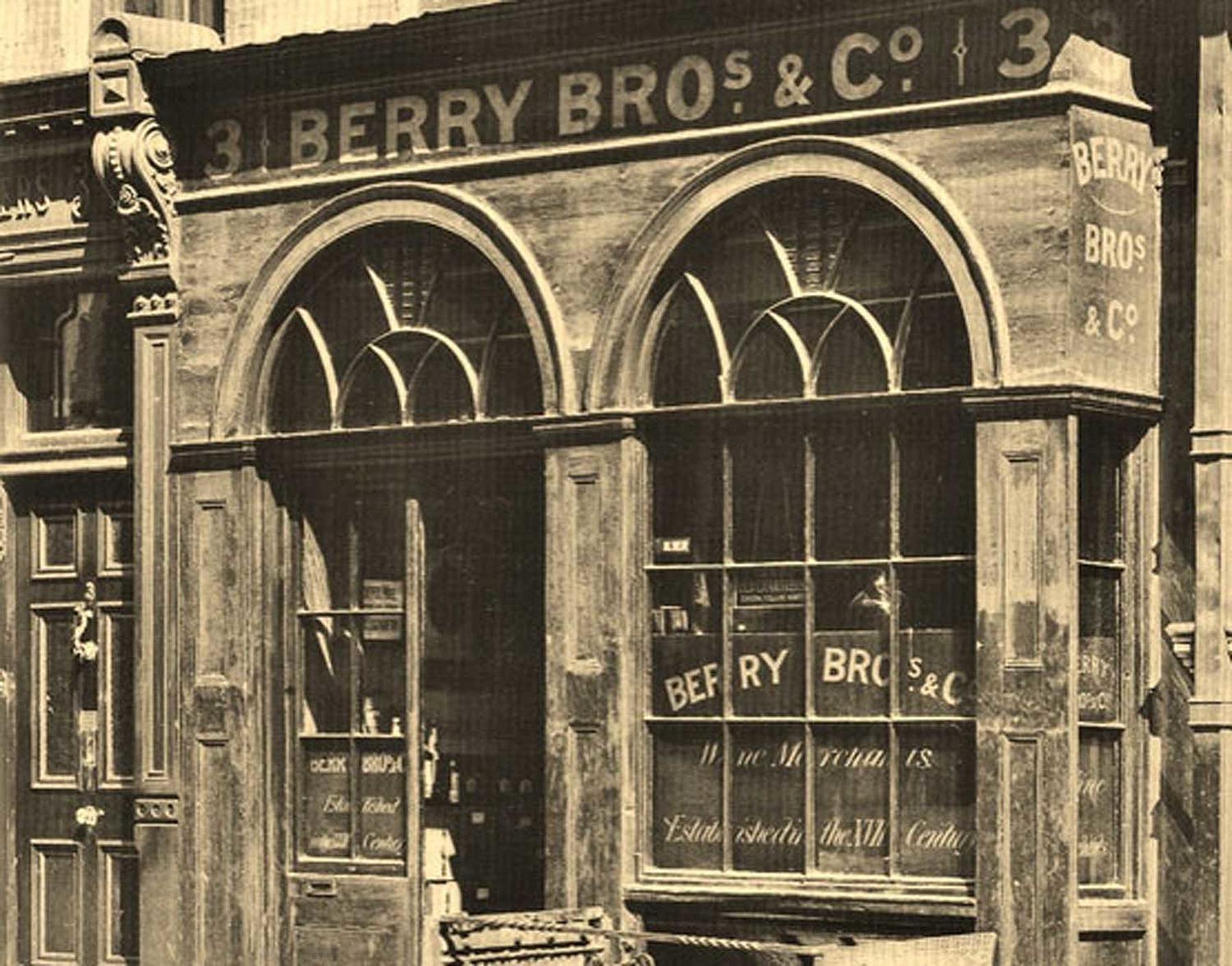
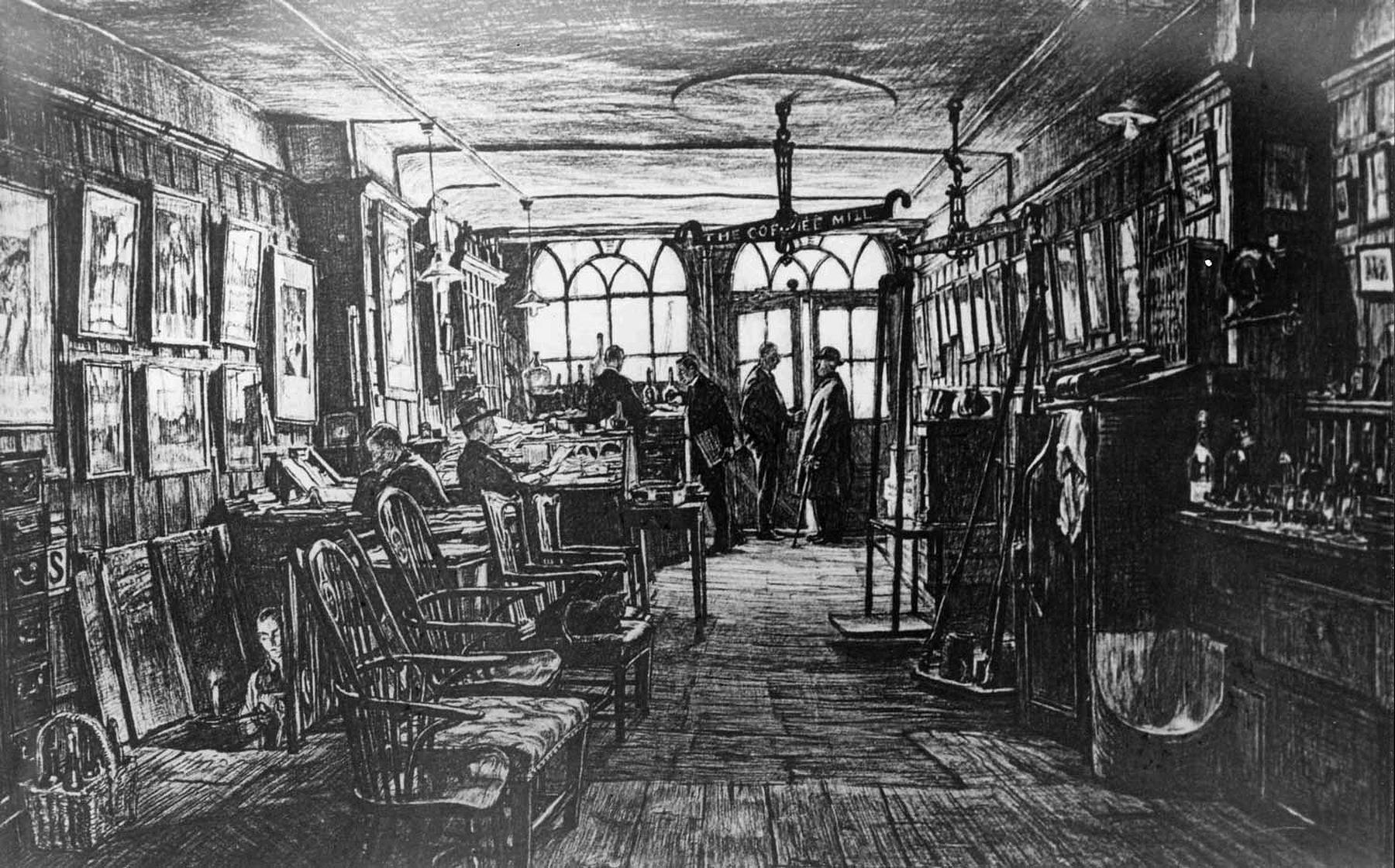
This substantial dark green bottle, filled with very drinkable dark red wine, is the fruit of a deeply rooted plant which has been growing in the charming, time-worn building of Berry Brothers & Rudd, at 3 St James’ St in London’s West End, since the day it was founded in 1698 until today, and hopefully it will continue to flourish long into the future.The very connection to past centuries - to the footsteps of William Pitt and Beau Brummel, to the Court, to Westminster and the City, and to the Bordeaux region of France - is all of value. It is easy to romanticise, and easy to forget, but irrefutably actual. It is what it is.
BLEND
As far as I know, GOC is a blend – it is impure - and that has its appeal. It aims to be popular, not esoteric. It aims to be an archetype of itself, rather than being a quintessence of anything.The very word claret is a hybrid (aren’t we all ?). We watch as a word from old French becomes, over time, a pure anglicism. And the vines too are a collage; Vitis vinifera grown together with rupestris; a happy marriage of France and America – the only way to beat the Phylloxera bug; time-honoured, collaborative and successful.It reminds us of our interwoven cultures – our boundaries blurred – which in these Brexit ridden days seem only more precious. Why, oh why unpick the weave ?
BRAND
The label is pleasing. Old-fashioned to some, timeless to others, but hand-made for sure, and in that way reassuring. It is an image of a place – somewhere I bicycle past many times a week – and its sense of familiarity is part of its attraction.I zoom out momentarily and wonder; is this talk of labels and brand just low-brow chit chat (even the word ‘brand’ makes some intellectuals shudder) ? Luckily the topic – a black and white drawing, simple script, white on black, black on white - transcends the question and makes it irrelevant.Of course places, like wines, have brand - both intended and evolved - and this influences how we relate to them and they to us.
LARGER THAN LIFE
Before finishing, I must ponder the bottle for a moment. Such an ordinary thing; green glass; two verticals connected by curved shoulders; a dimple at the base and a ridge at the top – but this is no ordinary bottle. It is super-sized; almost super-real, or am I exaggerating ?Maybe, but what is for sure is that it’s scale is affirmative over and above the norm. It says with strength and confidence ‘I am a bottle of wine’, and if it was a building, it would not only be beautiful and strong - a positive contribution – but also an affirmation; with a lasting and memorable presence.It is perhaps an example of that most un-mysterious of mysteries - finding the extraordinary in the ordinary.


